by Amanda Davis
It’s true that you can’t judge a book by its cover. (In fact, if you go here, you can see some of the worst covers for some of the best books of all time: https://lithub.com/50-very-bad-book-covers-for-literary-classics/). But while books often go through a number of designs depending on the publisher, album covers tend to be a little more significant. The design may not make or break a record’s success—Zooropa’s awesome artwork couldn’t save it from being, well, Zooropa. And (fight me on this if you have to) Thursday is one of the best bands with some of the worst covers I’ve ever seen. But do it right, and good album art will be instantly recognizable—iconic, genre-defining, whatever you want to call it. To some, the covers of Abbey Road, Velvet Underground, or Nevermind may as well be the Mona Lisa. A generation of emo kids donned T-shirts featuring the instantly-recognizable Demolition Lovers from Three Cheers For Sweet Revenge. What these covers typically have in common is their ability to speak to an audience—no matter how hard we try, we can’t help but judge the book by its cover. So it’s no surprise that Saves the Day’s Through Being Cool sent waves through the hardcore scene while also going down as one of the most iconic album covers in alternative music.
During the ‘90s (and into the 2000s) album artwork for emo, hardcore, and post-hardcore bands came in a few essential forms. Traditional art can be seen on records such as Drive Like Jehu’s Yank Crime, Sunny Day Real Estate’s Diary, the Get Up Kids’ Something to Write Home About, and At the Drive-In’s Relationship of Command. Some records, like The Shape of Punk to Come by Refused and Hello Bastards by Lifetime, used photographs of people, but they were off-centered and purposely secondary to the band and album names. But by far the most common design (and what partially sparked me to write this post) was what I like to call “pictures of stuff.” Typically these were photographs, though some were art, of (you guessed it) a random object or place. I could go on for too long naming these—Life of a Spectator by Silent Majority, What It Is To Burn by Finch, Everything You Ever Wanted To Know About Silence by Glassjaw, Stories For The Big Screen by Lanemeyer, The Swiss Army Romance by Dashboard Confessional. You get the idea. What’s notable about the album artwork at the time was that they didn’t feature people, and certainly none of them featured the band. That was reserved for pop stars like Ricky Martin and the Backstreet Boys.

It comes down to image. Across every genre and decade, bands have looked for a way to connect with their audience—one of the initial and most effective is through album art, especially in the days before you could listen to a record for free on YouTube or Spotify before committing to buying a physical copy. This is why London Calling resonated with a generation of punks: the rebellion of Pennie Smith’s iconic photo combined with the nod to Elvis, a man who himself had broken the rules of rock and roll, but since become a household name. If you couldn’t get a single on the radio, or people wouldn’t listen to the WAV file you sent them over AOL (too many damn megabytes!), the album cover was as good a hint at the music as the thirty-second iTunes samples were for my generation.
Emo has always been more about a sensibility than a particular sound, which is why bands from Rites of Spring to Paramore can fit into the genre. Part of that sensibility is the search for belonging. This is why emo has always resonated so strongly with younger generations and evolved with them—adolescence and young adulthood is often the most unstable, confusing point in life, and many of us turn to music (whether creating or listening) to help us discover ourselves. Who am I? Where do I fit into this world? (Should I become vegan?) And maybe this band can help me figure it out, because they’re misfits like me. Ultimately, I think this is why the “pictures of stuff” album covers were so prevalent. It de-centers the band. In a subtle way, it tells the listener: “You’re not here for us—you’re here for the music. You’re here to learn something about yourself.”
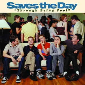
With this in mind, it’s really no surprise that Saves the Day’s sophomore album got people talking. The now iconic cover features the band sitting on a couch, with a house party in full swing behind them. At the time of the record’s release in 1999, the design earned a mixed response; visually, it was totally different from what other bands in the scene were doing. Some people instantly branded them as sellouts for being front and center on their own album. (The intended irony of Bryan Newman and David Soloway’s concept was lost on the adamantly anti-rockstar hardcore scene.) Others were intrigued. The photo shows them as young and awkward, like a lot of their audience—polos and argyle socks and khakis and trying to talk to girls. The weird transition to adulthood that comes with growing up and navigating parties and going to college. In a way, it achieves the same kind of signaling as mentioned before. The guys who made this album aren’t cool. They’re like you. So maybe you should give it a listen.
The 2000s saw a considerable increase in pop-punk and emo album covers that featured the band, such as Move Along by the All-American Rejects and Take This to Your Grave by Fall Out Boy. Perhaps the most visually derivative of these would be Simple Plan’s No Pads, No Helmets…Just Balls; the cover features the band surrounded by streamers and seemingly shocked by the beautiful girls they’re partying with. It’s a more overt (and maybe egregious) take on what Through Being Cool was trying to say with its cover, but it shows the shift that occurred regarding this form of visual shorthand. Now, rather than being removed from the art, these bands were placed on the same level as their audience through the idea that they were just as awkward, uncomfortable, and quirky as their listeners. This was also perpetuated by music videos, many of which featured dorky, failed attempts at high school romance (“I’m Not Okay” and “Dance Dance” come to mind—nice guys really do finish last, huh?) And while Saves the Day and their contemporaries may have outgrown the teenage awkwardness that influenced their earlier music, there will never be a shortage of kids who relate to their struggle. It’s the reason emo keeps coming back again and again, in different forms—whether it’s the revival of “MTV-mo” influenced by When We Were Young and Emo Nite, or the new wave of bands that have revived the genre (thanks in part to TikTok) such as Arrows in Action, 408, Magnolia Park, and Letters for the Oddities.
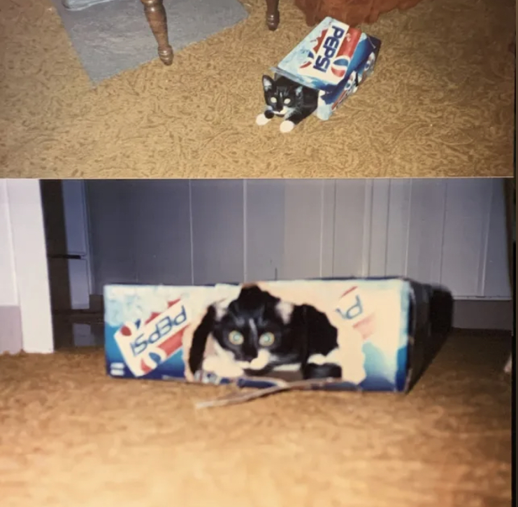
I’ll leave you with two of my favorite recent album covers, the first of which comes from calendar year’s EP a life cycle (2021). The artwork features two pictures of a cat in an empty Pepsi can box. The photos are off-center, like you were meant to scroll through your camera roll to the second, but didn’t quite make it that far. It’s imperfect. The lighting is of about the same quality as the music production. And nowhere on the cover do you see the album or the band name. It’s “pictures of stuff” in its purest form.
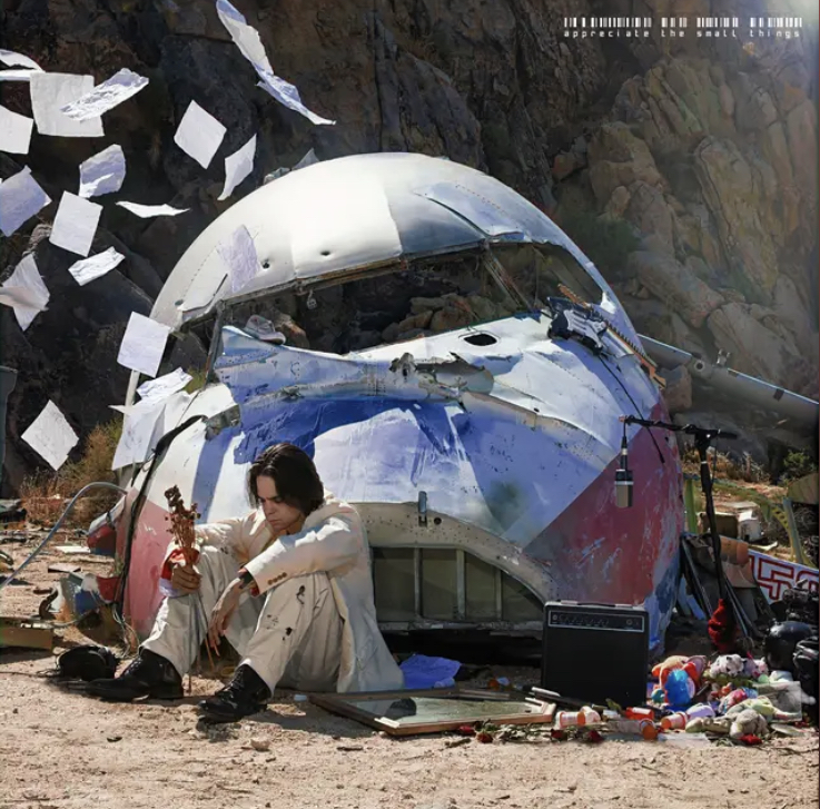
In contrast, I have also been obsessed with Ezra’s appreciate the small things (2024). The cover of his debut EP features Ezra sitting in front of the wreckage of a plane crash. He’s surrounded by a broken mirror, pill bottles, stuffed animals, and a microphone and amp. Loose sheets of paper flutter in the air around him. The intricacy of the visual storytelling may be lost on those who don’t afford the artwork the attention it deserves—sure, Ezra himself is on the cover, but he is purposely off-centered and surrounded by the self-destruction that is at the core of his music.
As humans, we have a unique ability of understanding things non-literally. In language, we call it metonymy—a literary device that uses related words to add flavor to writing. In comics, we can understand the “gutter” (the space between panels) to indicate a passage of time. And in its simplest form, a stick figure with or without a dress will tell us which bathroom to use. Album covers are no different. However subtle or overt, they signal to potential audiences and give us some insight into the music. They’re a form of paratext—as Gérard Genette describes in his seminal book on the subject, these are elements outside of a text that contribute to audience understanding and serve as a bridge between creator and consumer. So, no, we can’t judge a book by its cover. But covers are created for a reason, and oftentimes they tell us something about the art they represent. And I know that (for me, at least) any time I hear the feedback at the beginning of “Shoulder to the Wheel” and sing along to the lyrics “I’m having a bad week / I miss my mom”, I’ll be thinking of every high school party where I was Eben—sitting on a couch biting my nails because I was too nervous to talk to the girl I liked.
Maybe you don’t know the band. Most of the time, you never will, and that’s okay. But in a way, they know you. And whether it’s Through Being Cool or Abbey Road or whatever else resonates with you, there are bound to be album covers that you’ll never forget.

Leave a comment